
I am Colter Hinckley.
Welcome to my professional portfolio. Feel free to stay awhile.
Graphic Design Portfolio
Photography
"It seems that no matter how hard we try, we often fall short in physically capturing the vibrance of a moment we want to remember. Thats why I strive to capture moments, not as the camera does, but as we remember it being. Warm, cold, colorful, bleak, intimate, distant: you name it, I capture it. Moments to be remembered, as you remember, every time.
That's the Hinckley way."
My Photography Philosophy
Notes on Editing
Remaking a memory
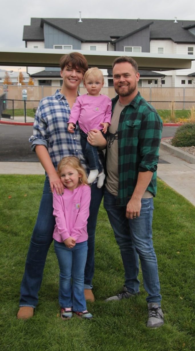
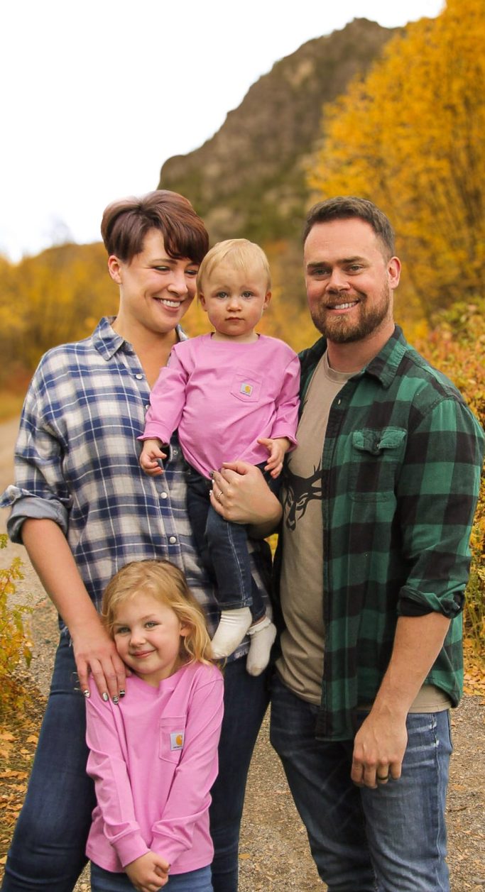
Photo editing is a fickle thing. Most photographers have a different approach. Some like to edit minimally, while others dive more into photo manipulation. My editing style is versatile. I seek to take the photo back to the moment it was taken and try to capture how the recipient would want the moment to be remembered.
For example, in a photoshoot we didn't have a good shot of these specific family members together. So I captured some shots of them on their front lawn, and was able to transform it. However, other photos need less adjustment to fulfill this. Keep this methodology in mind as you browse my photo galleries.
Portrait Gallery


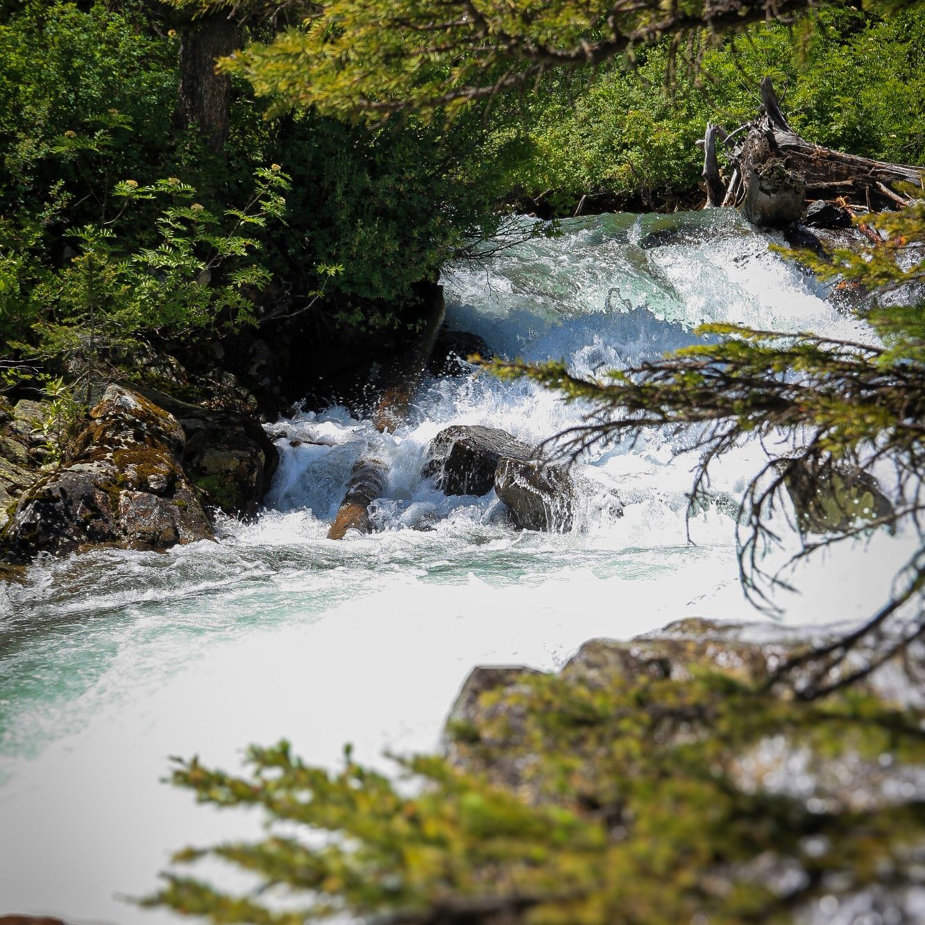
Nature and Wildlife Gallery


Graphic Design
"Often times the best design is that which can be understood, even at a quick glance. And when it comes to your business, your events, your passions, or your family, every glance counts. I create designs that reflect you, stand out, and encourage passive viewers to turn back for a second look."
My Graphic Design Philosophy
Design Showcase Business Design & Marketing
Advanced Home Inspectors
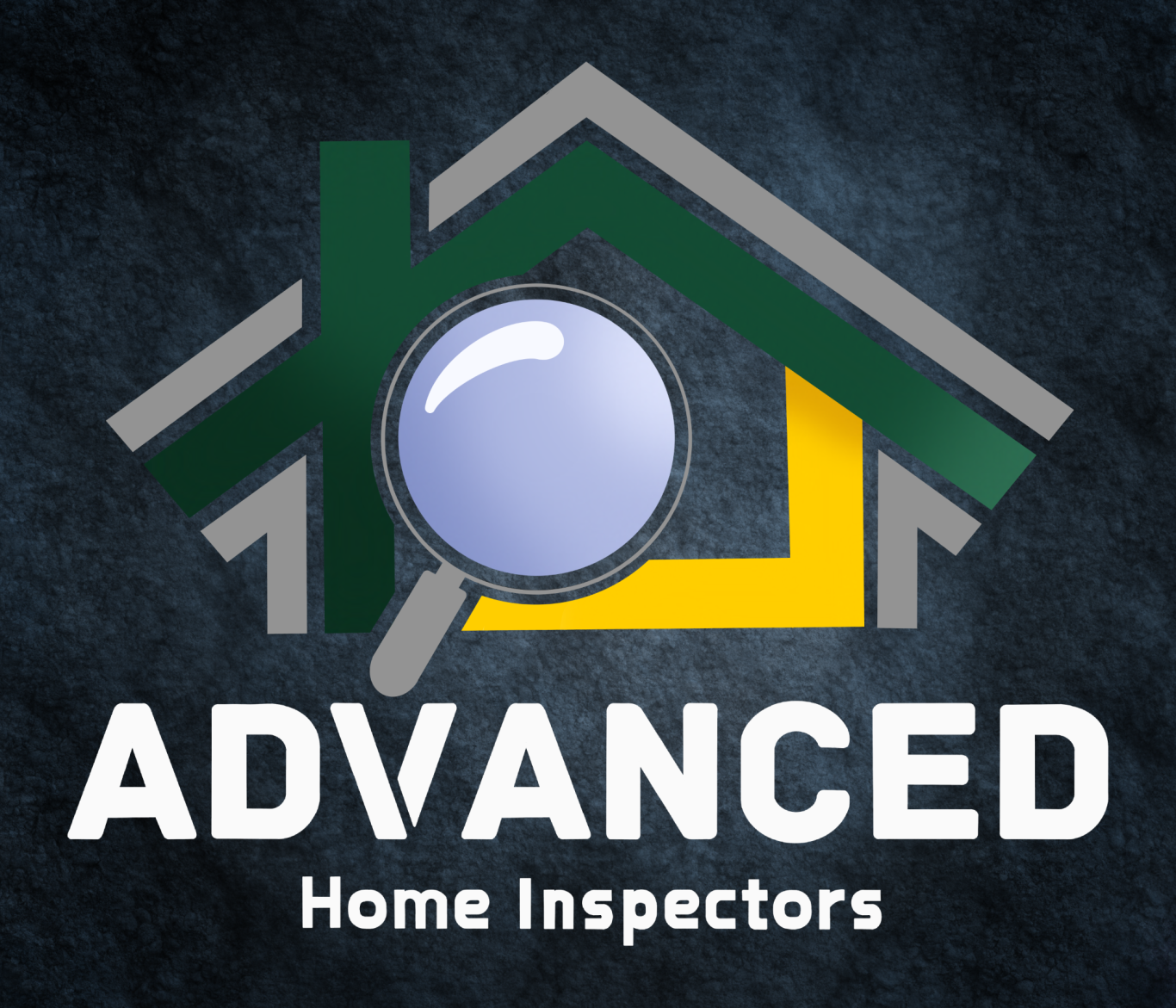
Advanced Home Inspectors is a small business located in Logan, Utah. They approached me wanting a clean, modern design that felt masculine and gave a bold impact. Their previous attempts at a design left them unsatisfied, as they felt dated, and forgettable. However, after consultations, rounds of design iterations, and feedback, we settled on a design that felt fresh, modern, and head turning, launching their small business into a community beacon that has brought in consistent, and loyal clientele.
Through client consultations, I developed a tagline for the business. "Now THAT'S Advanced" has become a memorable tagline in the company. Varying positive company attributes accompany the slogan, giving the owners options for variety, while showcasing what makes them stand out among competition.

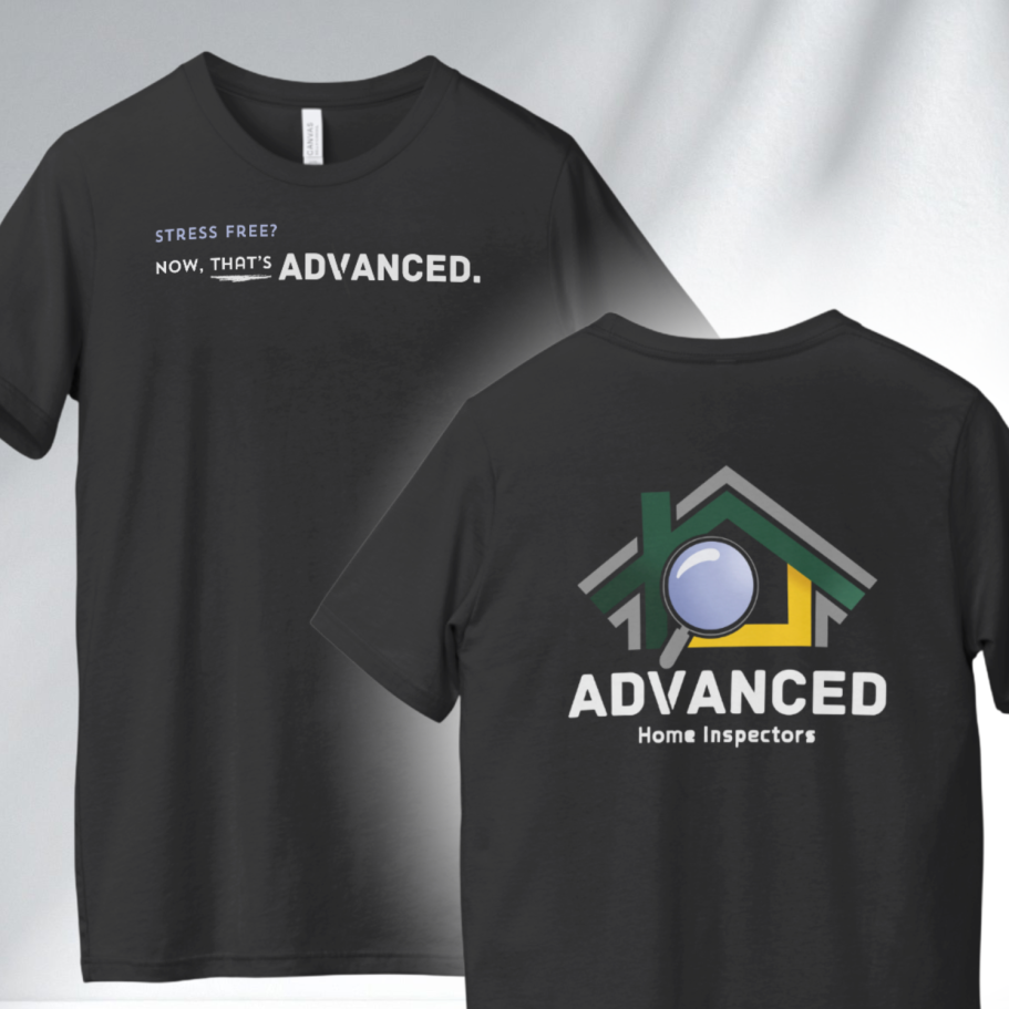
I adapted this design to include a black and white variant. This challenges me to ensure my designs have striking silhouettes, that catch the eye at a glance, and are usable in varying no-color formats.
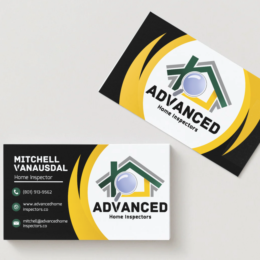
Once branding has been established, its my job to ensure that it can be effortlessly adapted and used in multiple formats by the client. I often create business cards as part of my branding kits, to show the business owners how their designs can be utilized, while providing them a head start in personal marketing.

Holiday Advertisement
The holidays can be a slow season for the home inspection business. Most people aren't purchasing new homes, when the season demands money and time be spent in other ways.
This ad, helped this home inspection business find their customers, that led to a boost in sales 75% higher than a typical the holiday season.
Poppy Lane Floral
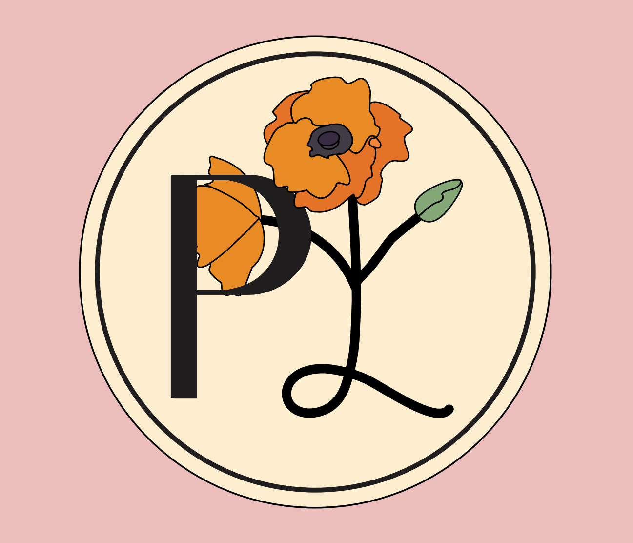
Poppy Lane Floral is an independent flower shop, located in Rexburg, Idaho. The owner approached me with only one request: pink and orange, classic poppy colors. They reached out to me just as they started their business, so they didn't come into our consultation with a clear brand image. They wanted a feminine style, but beyond that they were open to ideas. In our consultations we discussed modern, pop art, and classical styles. In the end I helped this client discover the aesthetic and voice of her brand, through a clean classical style. Its representative of familiar designs, but feels updated. This design was debuted at a showcase of local vendors to high praise, noting the French inspired design, bold color choices, and poppy motif as highlights of this memorable design.
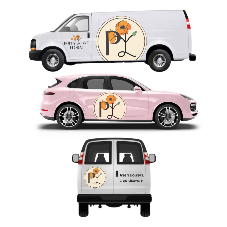
Different businesses have different needs. One common need in the world of florists are delivery vehicles. While this florist hadn't even begun to establish the infrastructure for a flowers by delivery service, these design mock-ups helped showcase to them what a Poppy Lane Floral delivery van would look like. This would instantly increase the visibility of this business, establishing it as a community icon.
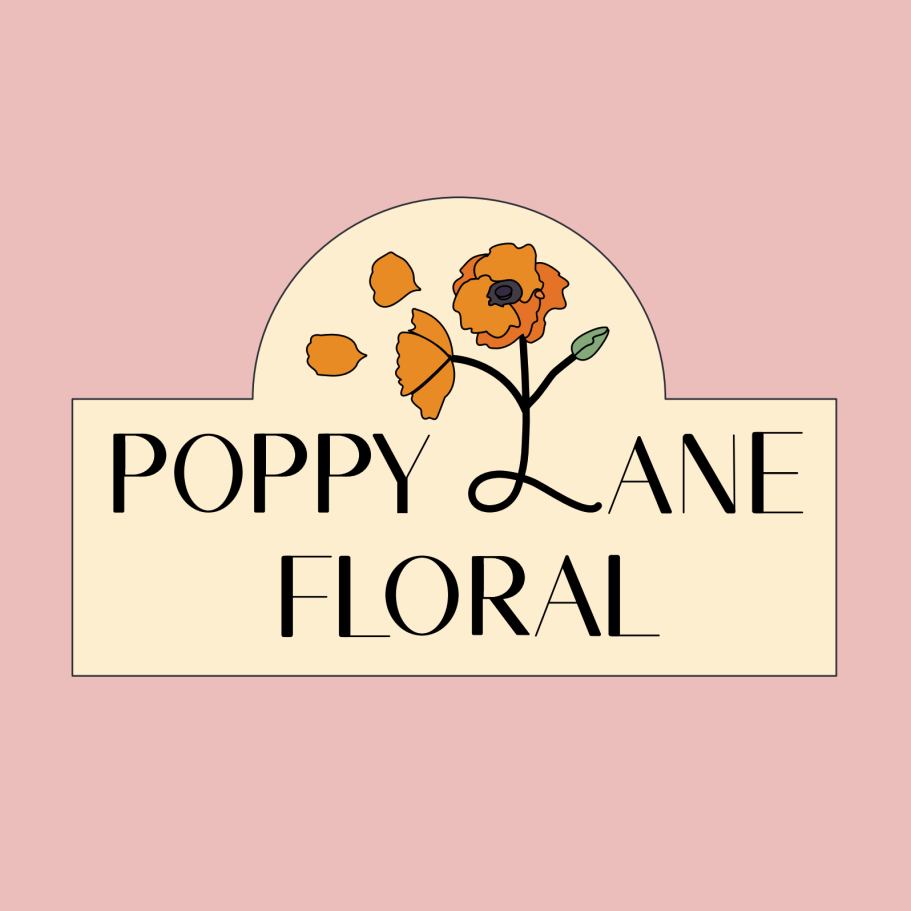
Choosing a font to represent a business is a decision that should not be taken lightly. While the client and I landed a modern twist on a classic french feel, we established that heavy flourishes would make the design too distracting. Calligraphy that was overly ornate would decrease legibility. Untimely I designed this all-caps font that felt clean, and elegant, striking a perfect balance.
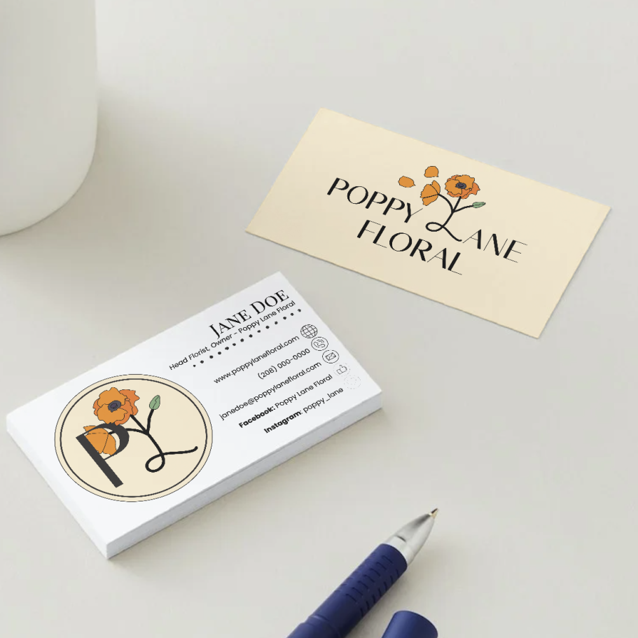
Although pink and orange are analogous colors, in the shades chosen for this design they can overwhelm a design. Its important that they are used tactfully to produce a palatable design. In this business card design, I omitted the pink to give it a more adult refined look. Knowing a brand means knowing what colors should be used, and when.
TCUTZ - Professional Barber

TCUTZ is the marketed name of a professional independent barber in Rexburg. The client initially approached me with an AI-generated concept—something many designers encounter today. While these references are usually shared in good faith, they also highlight the growing challenge of demonstrating the value of independent design. My goal was to show how a basic concept could be elevated into something more intentional and memorable. Through the process, we refined the original idea into a design that visually communicates the brand by splitting the logo in half, drawing inspiration from streetwear and grunge aesthetics to create a bold, distinctive identity.
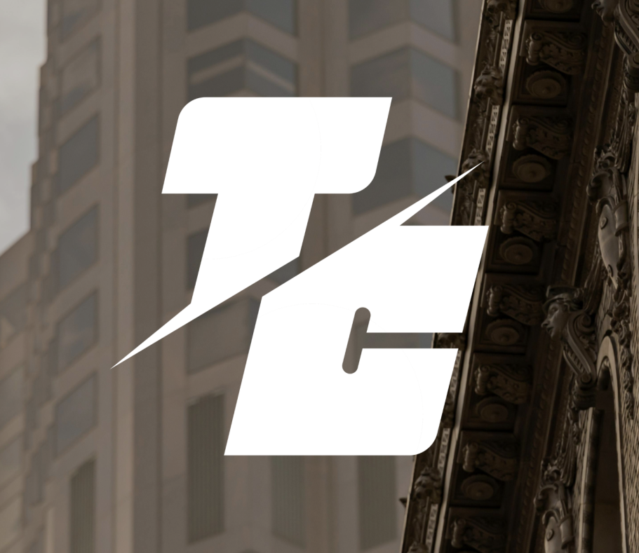
The original AI reference felt static, so I introduced movement by sharpening the southwest-to-northeast angles and leaning the design slightly to the right. Progress is often associated with upward and rightward motion, seen in how we read and how growth appears on business graphs, so this direction subtly communicates momentum. While the logo remains simple, its refined details help it stand apart from typical AI outputs. It also works well in monochrome, making it versatile across backgrounds.
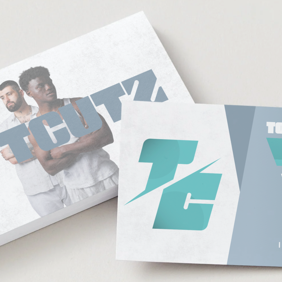
Since this client didn't have any initial color requests, we got the opportunity to play with a bunch of options. We tried red and purple but we leaned into this aqua blue and electric blue. However I knew they didn't mesh well in the same design. Thankfully this quirk became a strength, as we discovered this gave us the opportunity to do a "dark mode" and "light mode" version of the logo which heavily increased the designs versatility.
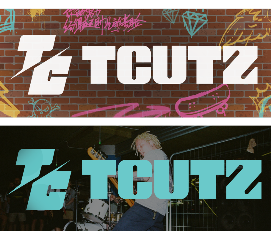
Taking inspiration in streetwear style gave me the opportunity to try some new ideas. Since the logo design was so simplistic, we could use bold backgrounds. I developed this graffiti wall design, and used complementary colors to make a bold new design that provides high visual excitement. I also did this version that showcases a band with unique hairstyles, and streetwear aesthetics visually representing the brand. With the bold new font I developed to accompany the logo, this logo design has endless versatility.
Undergrad - Undergrad Run Club

Undergrad is a running company, created by college students, for college students. A few running obsessed students realized that in the most active phase of life, many students were choosing a sedentary lifestyle. Running should not feel exclusive to the elite athletes, but should be a social gathering, that welcomes all to participate. Through an intense design iteration process, the logo for Undergrad , and their race hosting division, Undergrad Run Club, was born. This logo came to pass during a crucial rebrand, that elevated this company from a small town western themed racing company to a modern, sleek running company who's style rivals that of Adidas and Nike.
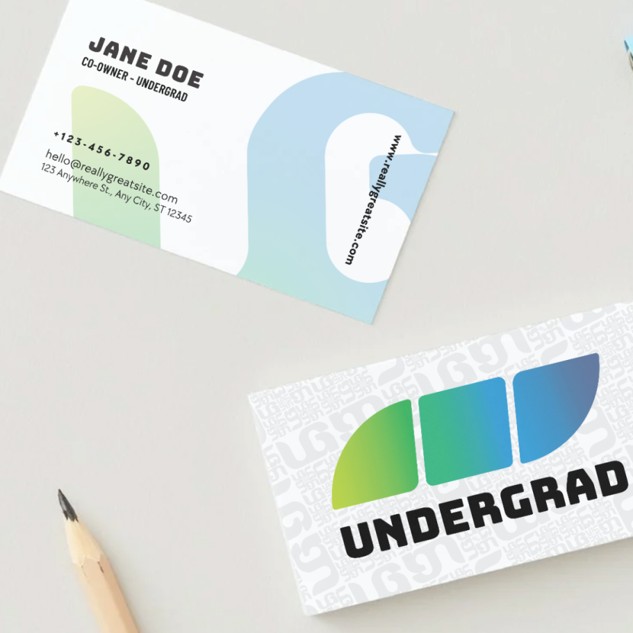
Business Cards are essential for budding business owners to not only market their business, but to market themselves. One of the best ways to build your business is to network with other business owners for investments, sponsors, and brand deals. A good card shows other owners that you are a real businessperson that deserves respect, and professionalism.
One benefit of simplistic designs, is that they can be used in a variety of ways. Shown here is the Undergrad Run Club logo, turned into a pattern that can be used to expand the scope of the design. You can see this application in a background for the business card in the photo proceeding this.

One of the most unique elements of this design is the need for a second logo. Ultimately, through the design iteration process, we loved both of the designs chosen for the main logo. Part of the Undergrad Brand, is their Run Club; the division that hosts all of their races. We decided on having this be a separate but unified logo for the brand that represents the Run Club, which adds variety and clarity.

Logo / Winning Medal Crossover
The unique three piece design of the logo is simple, recognizable, and versatile. The tilt and sections of the design represents movement and progression. The abstract symbolic logo mark can be used in many different capacities. The medals for winning undergrad races will be designed in these 3 uniques shapes, representing 1st, 2nd, and 3rd. One all three are collected, the medals will magnetize together, creating the logo itself, making the owner of all 3 a "True Undergrad".
Design Showcase Special Designs & Commissions
Icon Design
Universal Studios Monsters

Design Style Matching
The challenge was presented to me to do a unique icon design, but to match the style of this school items icon set. I noted the unique features, colors, and details that make the style unique.
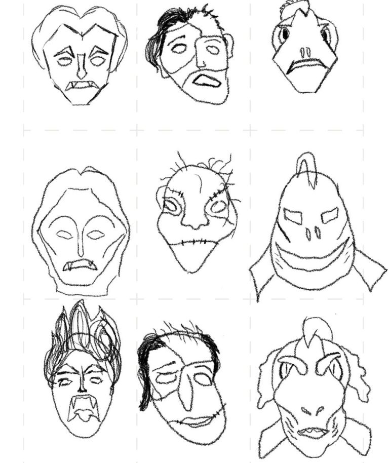
Idea Iteration
I played with several different icon sets, but decided that an icon set of the classic Universal Studios monsters would fit well in this style. So I sketched several different iterations of what the monsters could look like, and ended up using elements of each in the final design.
Final Sketches
As I decided on the final designs, I created basic sketches that had a base in sharp lines, and severe curves. I began playing with color before entering into Adobe Illustrator, and landed on these designs.
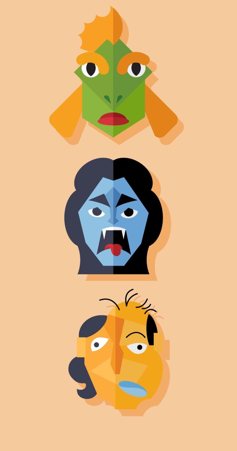
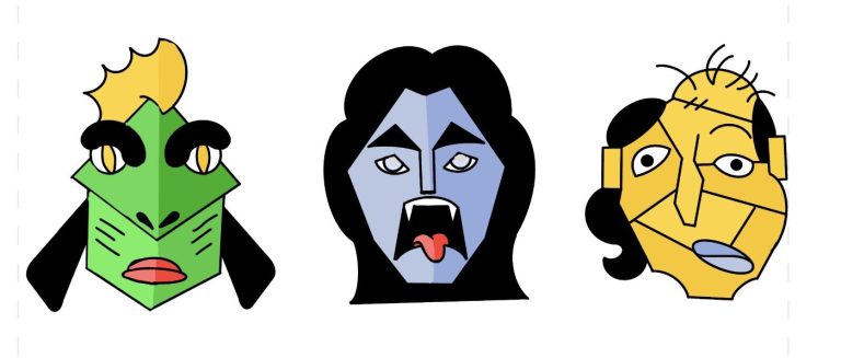
Completed Logo
After hours of tweaking, I finally landed on my final design; a 3 icon set of The Creature from the Black Lagoon, Dracula, and Frankensteins Monster. I love the fact that Frankensteins Monsters flesh isn't the typical green, as I thought it more appropriate for my swamp monster. The diseased orange skin, and cold blue lips gave a new spin on the creature that I thought was refreshingly unique. Note that his eyes are the same size, yet one is inverted.
I was able to use almost all the same colors as the original icon set, which challenged me, yet it helped me see these classic characters in a new way. I used less black in the swamp monster to make his design more harmonious. Although they all have humanistic elements, I really tried to lean into the "monsterness of the design."
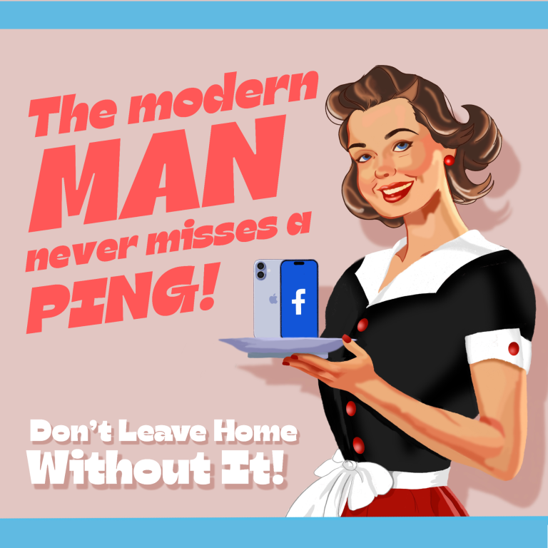
Social Media Propaganda Piece
Inspired by the bold colors, typography, and illustration style of 1940s–50s advertising, this piece mimics the visual language of wartime propaganda. Instead of promoting war bonds or consumer goods, it satirically advertises social media as the new cultural obsession, highlighting modern pressures for validation and influence online
This provided me with a fun opportunity to practice my drawing skills from a reference, and to channel it into something more artistic.
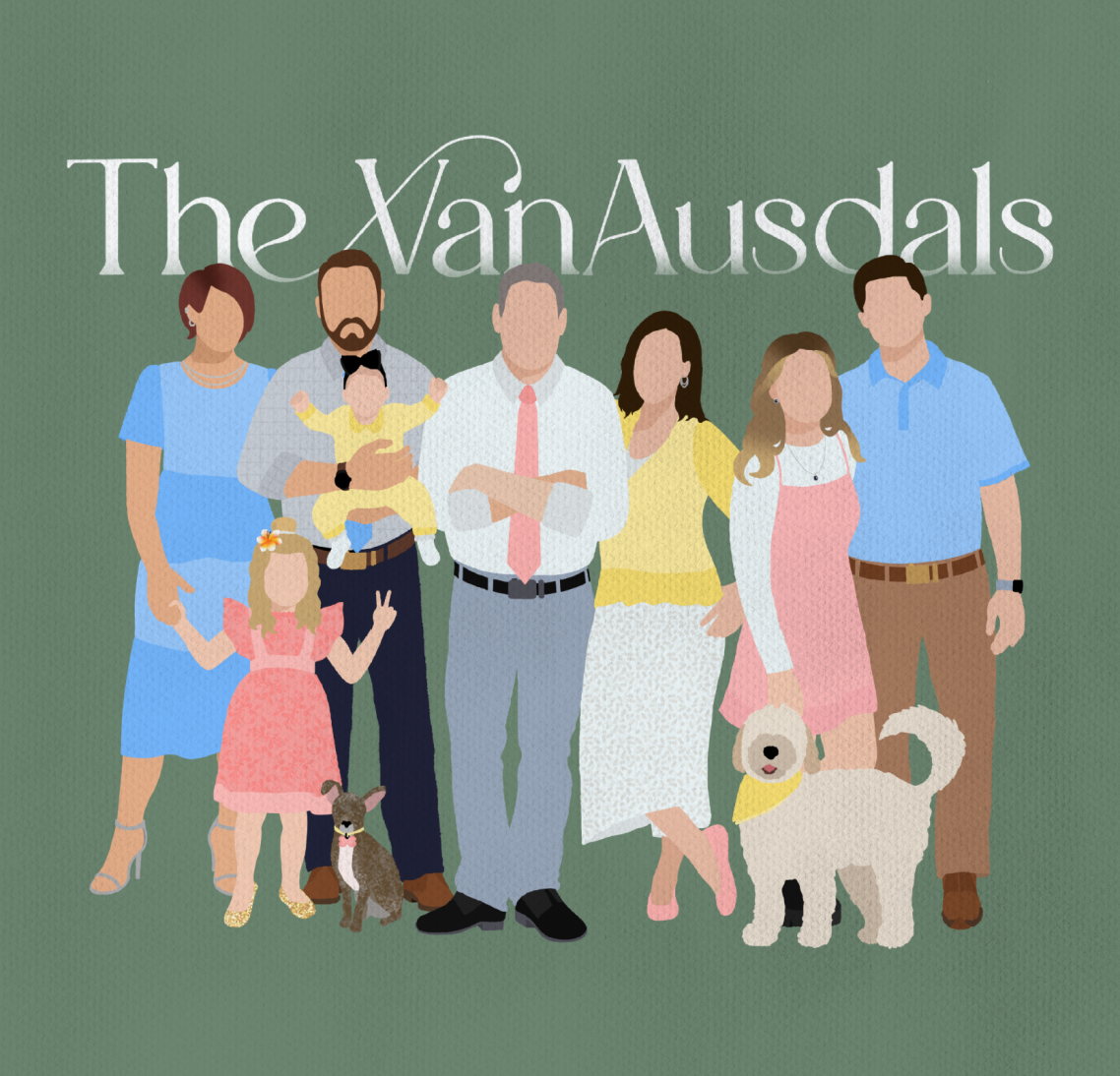
Family Portraits
In Illustrated Styles
My illustrated family portraits transform photographs or photo references into timeless artwork. Rather than focusing on hyper-realistic detail, I use simplified forms, thoughtful color palettes, and subtle textures to create a cohesive visual style. By removing small details and focusing on posture, clothing, and composition, the illustration captures the feeling of the family rather than just a literal image. Each piece is designed to feel timeless; something that can be displayed in a home and appreciated for years to come.
The College Disciples Podcast

The College Disciples - A "Come Follow Me" Podcast, was a weekly scripture study podcast I had hosted with some college friends for a few months. While its no longer active, it was. a blast to host, and created an opportunity for me to create a personal marketing piece. The concept of the podcast was to create a scripture study podcast geared to college ages young adults, hence the name. I drafted up this design: a graduation cap to illustrate the college aspect, but the brim of the cap is a depiction of open scriptures, the tassel spawning out of a bookmark lying on the page. Instead of the graduation year, I have "est. 2024" adorning the tassel - the year we founded our podcast. All-in-all the warm, deep colors invoke a feeling of comfort, understanding, and themes of notable educational institutions.
Also notable is the fact that this design is 100% hand drawn, challenging me to practice straight lines and soft blending.